Call For Hope is a non-profit organization whose mission is to help West African newcomers adjust to life in Winnipeg, Canada, currently helping people through financial and immigration support. They required not only an identity that stands out right from its launch but also an inspiring brand guideline document to consistently apply the identity. This was essential to ensure that all activities and materials will appear mutually supportive and form one coherent entity.
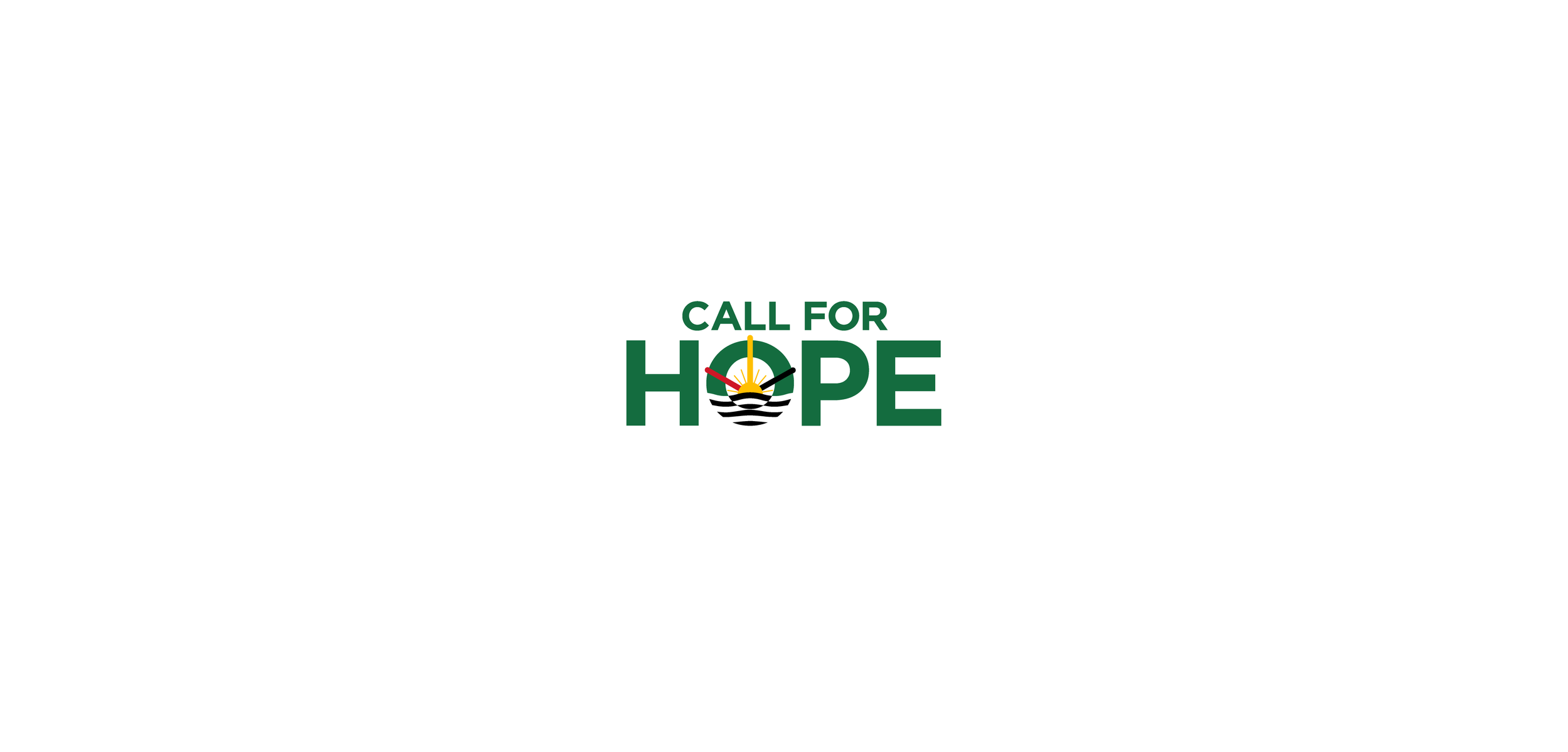
Inspired by the organization’s values: hope, support, encouragement, and family, the new logo features a sun on the horizon and the sea, symbolizing the hope of newcomers who cross the ocean to settle in a new country.
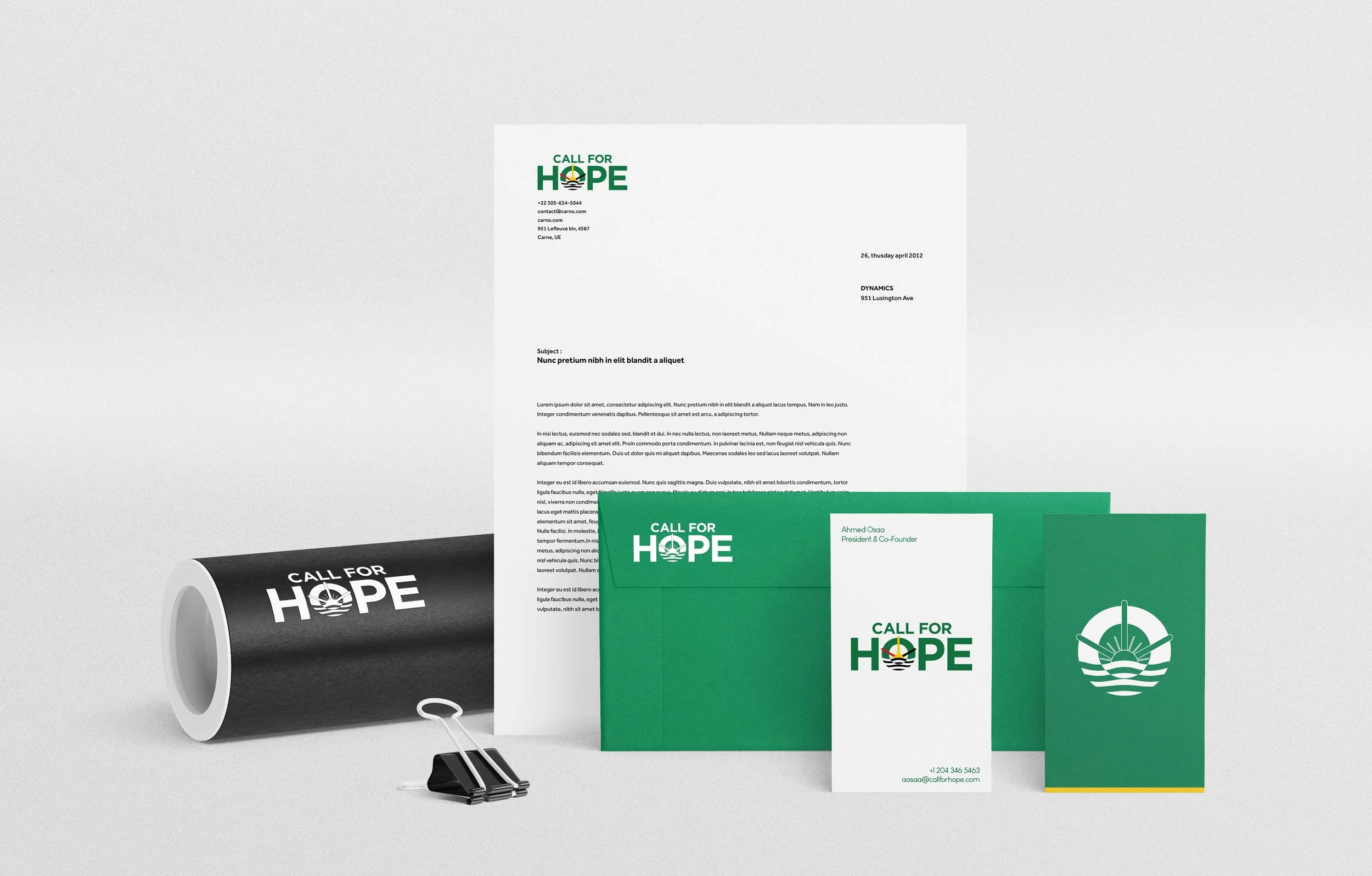
Visual identity